

Six Eyes. Worn.
A repositioning campaign for the Gojo Bracelet, elevating it from fan merch to luxury collector's jewelry for the JJK community.
Anime world integration + luxury positioning
A luxury product without a world
When I first approached this project, the brand had the fundamentals of a premium jewelry product quality materials, handmade production, a meaningful cultural reference, but was presenting itself through a generic luxury lens. The photography was clean. The typography was refined. The product page was competent.
What was missing was the world.
Kraymer Art's customer is not a generic luxury jewelry buyer. They are someone who grew up with anime, who understands the mythology of Jujutsu Kaisen, who knows exactly what the Six Eyes represent and who wants that meaning to live in the objects they choose to wear. A brand that speaks only luxury loses the depth. A brand that speaks only fandom loses the credibility. The design challenge was to hold both simultaneously.
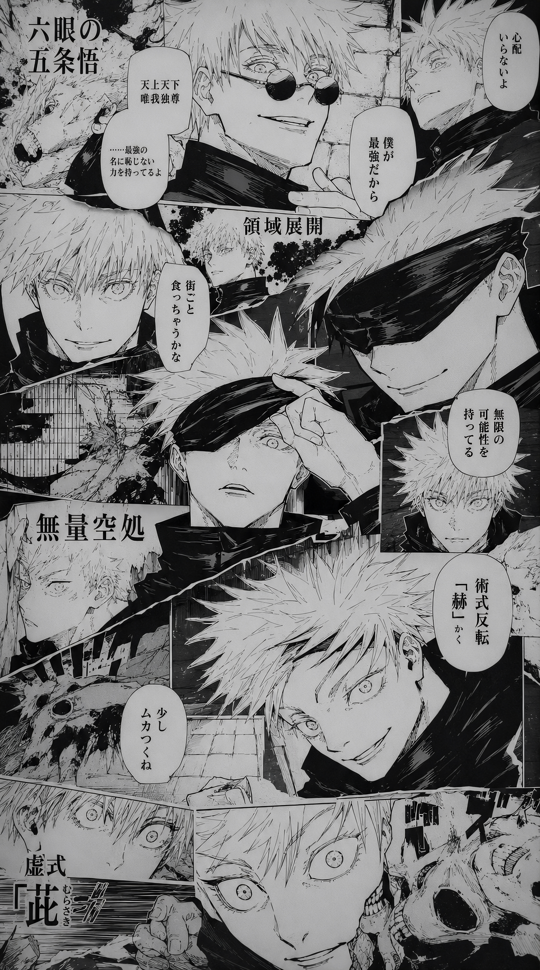
Two worlds, one visual language
The creative direction I developed is built on a single tension that becomes productive: luxury precision meets anime mythology. The result is a brand that a JJK fan reads as deeply authentic, and a non-fan reads as sophisticated and considered.
The luxury register
The product justifies a premium price point. The materials are real 18K gold, sky blue zircons, 925 silver. The typography, spacing, and restraint of the layouts maintain the luxury register even as the cultural reference becomes explicit.
The character
The most powerful move in this campaign is generating characters the buyer can inhabit. The AI-generated figures white hair, blue eyes, Gojo's unmistakable aesthetic create a mirror for the customer. Buying this bracelet is an act of identity, not just acquisition.
The graphic world
Anime communicates through graphic precision, bold composition, character archetypes, iconographic colour.
I introduced manga panel references, Japanese calligraphy, and the graphic flatness of anime into the campaign layout to signal cultural fluency to the audience.
The manga panel as design language
The main campaign visual is where the design intention becomes fully explicit. Rather than suppressing the anime reference in favour of a clean luxury layout, I made it the central structural element of the composition.
Building the mirror
One of the most deliberate decisions in this campaign was to generate photorealistic AI characters that embody the Gojo aesthetic, white hair, crystalline blue eyes, precise and otherworldly rather than using conventional jewelry models.
This choice operates on three levels simultaneously:
Community recognition - Aspiration without exclusion - Identity projection
The full spectrum of the brand
Anime audiences are not monolithic. The JJK fandom includes a significant male audience who relate directly to Gojo Satoru as a character, not through a female proxy, but through direct identification. The male campaign visual addresses this directly: the character is unmistakably Gojo, and the bracelet reads as a collector's piece rather than a feminine accessory.
A brand communication system built on the intersection of anime graphic language and luxury jewelry creates compounding advantages over time.
Each release becomes a collector's moment.
Each character introduced expands the universe without diluting the core.
Beyond the campaign
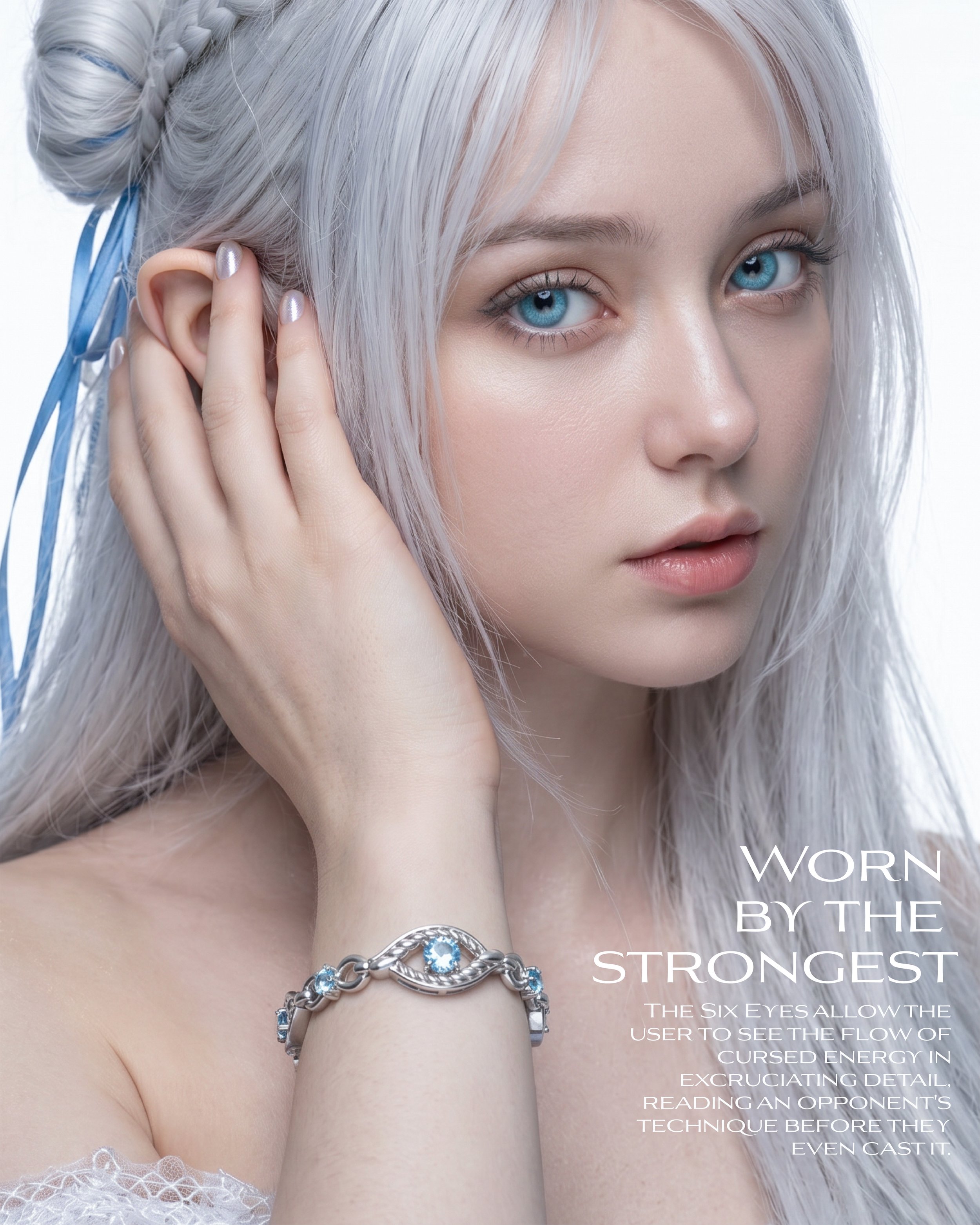

Instagram launching campaign for Gojo Bracelete
Claude and Chat GPT: For prompts and some initial image creations for testing.
Adobe Firefly - with model Gemini 3.1 Nano Banana 2: For character creations.
Post production: Adobe Photoshop and Illustrator